Project SE Anglia Ltd
brand / brand guardians
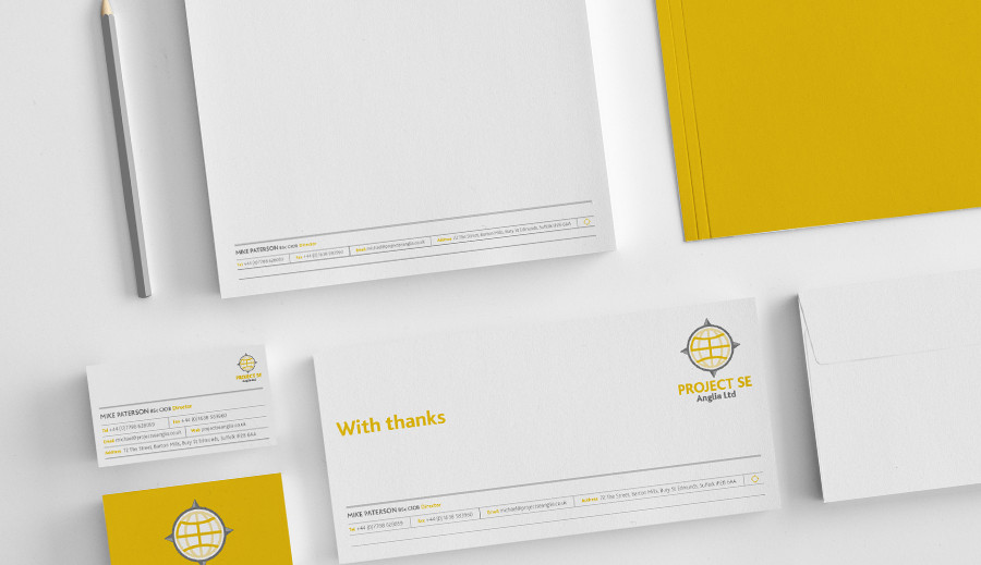
BRIEF
To create a brand identity that looks professional, well established and create a global look and feel. The challenge, was to achieve this despite the company name stating their geographic position.
SOLUTION
The logo centres around a global icon that features the letters ‘SE’ within it’s structure. It is framed by a compass devices that symbolises the south and east. The logo represents a global reach, knowledge, leadership and wisdom.
RESULT
Brand strategy, Brand Identity, Brand Guardianship