Heritage
brand / exhibition / brochures
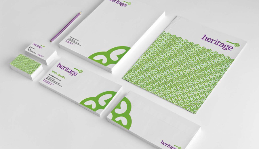
BACKGROUND
Heritage are the biggest Estate Agency in their region and had featured the same purple logo for the past ten years. With more competition coming into the area they wanted to refresh their brand identity to better suit their modern brand, while maintaining the Heritage which came with their history and name.
SOLUTION
Using a traditional typeface and key icon, coupled with a vibrant new colour palette and subtle ‘H’ on the key, we’ve given Heritage a brand identity which reflects the history of the brand, while providing them with a vibrant and modern style. The pattern – which comes from the key – offers another element which is traditional in concept but modern and stylish in execution.
RESULT
Brand Identity, Exhibition, Corporate Brochures